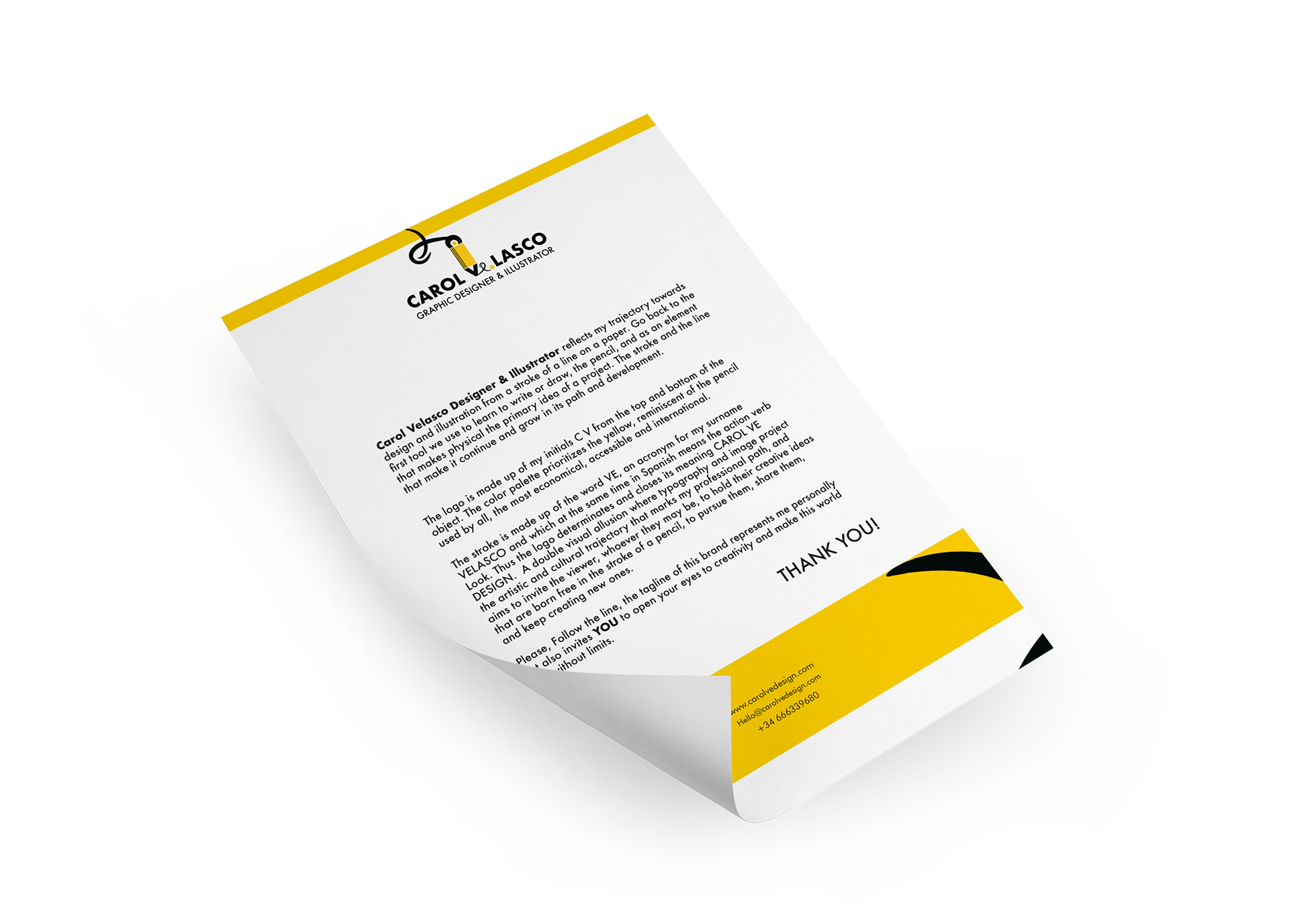
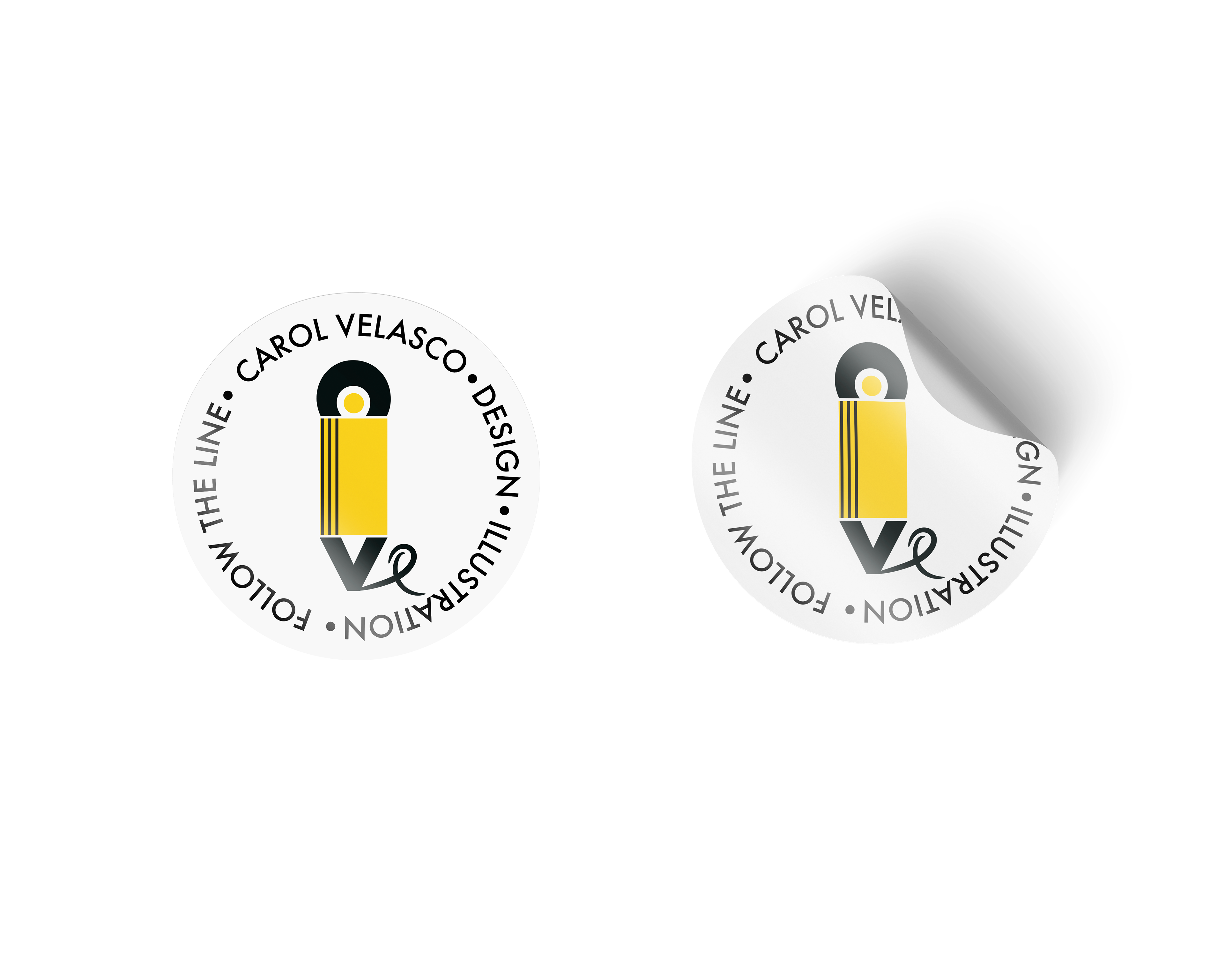
Carol Velasco Designer & Illustrator reflects my trajectory towards design and illustration from a stroke of a line on a paper. Go back to the first tool we use to learn to write or draw, the pencil, and as an element that makes physical the primary idea of a project. The stroke and the line that make it continue and grow in its path and development.
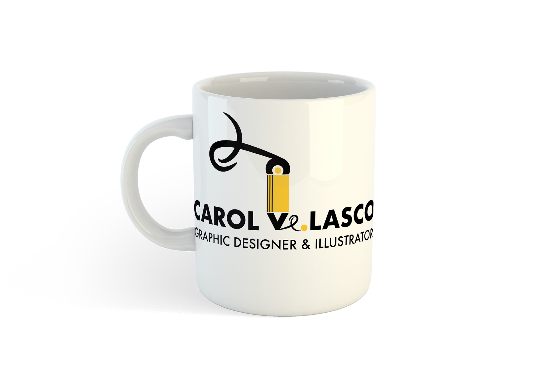
Main logo Carol Velasco Graphic Designer & Illustrator
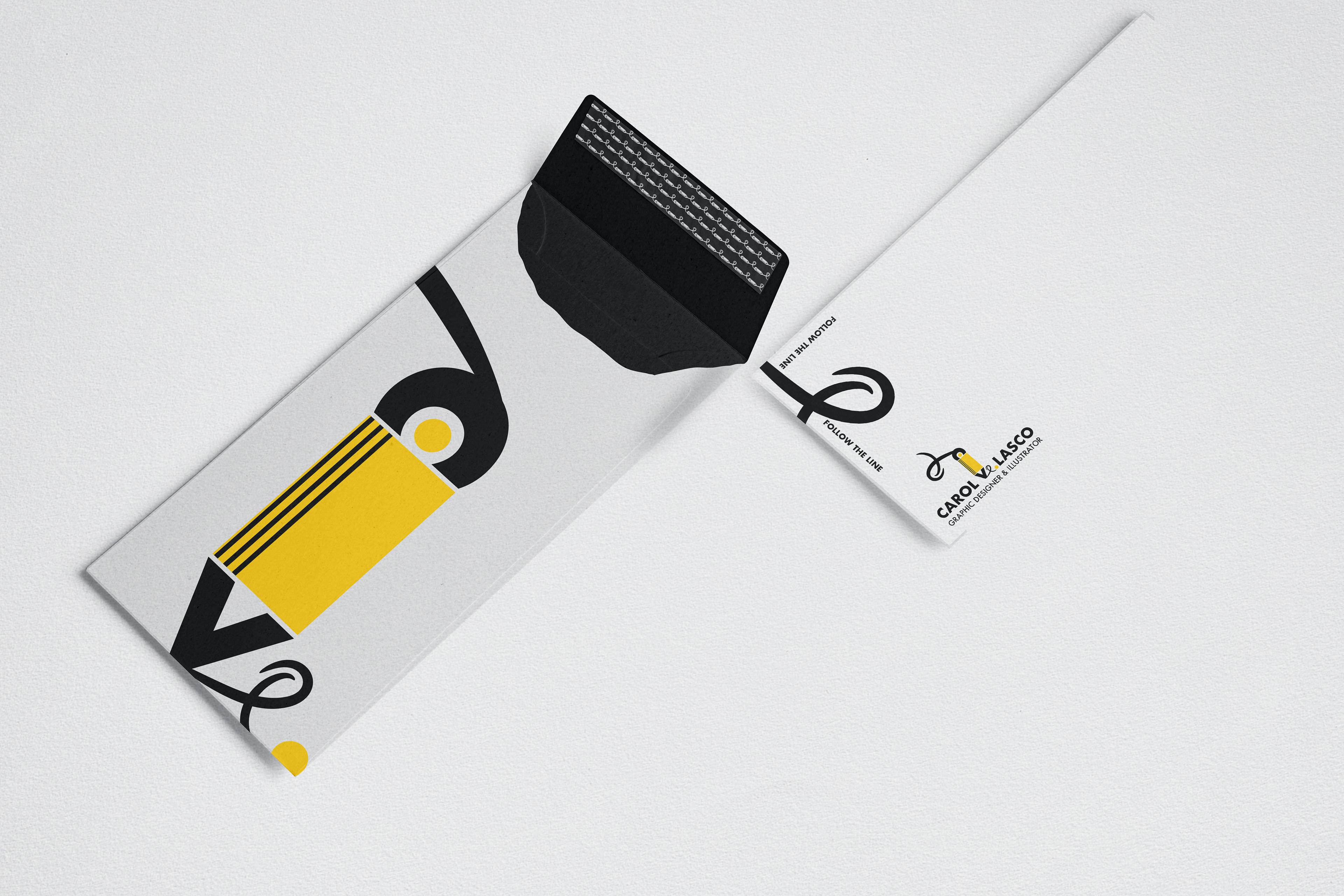
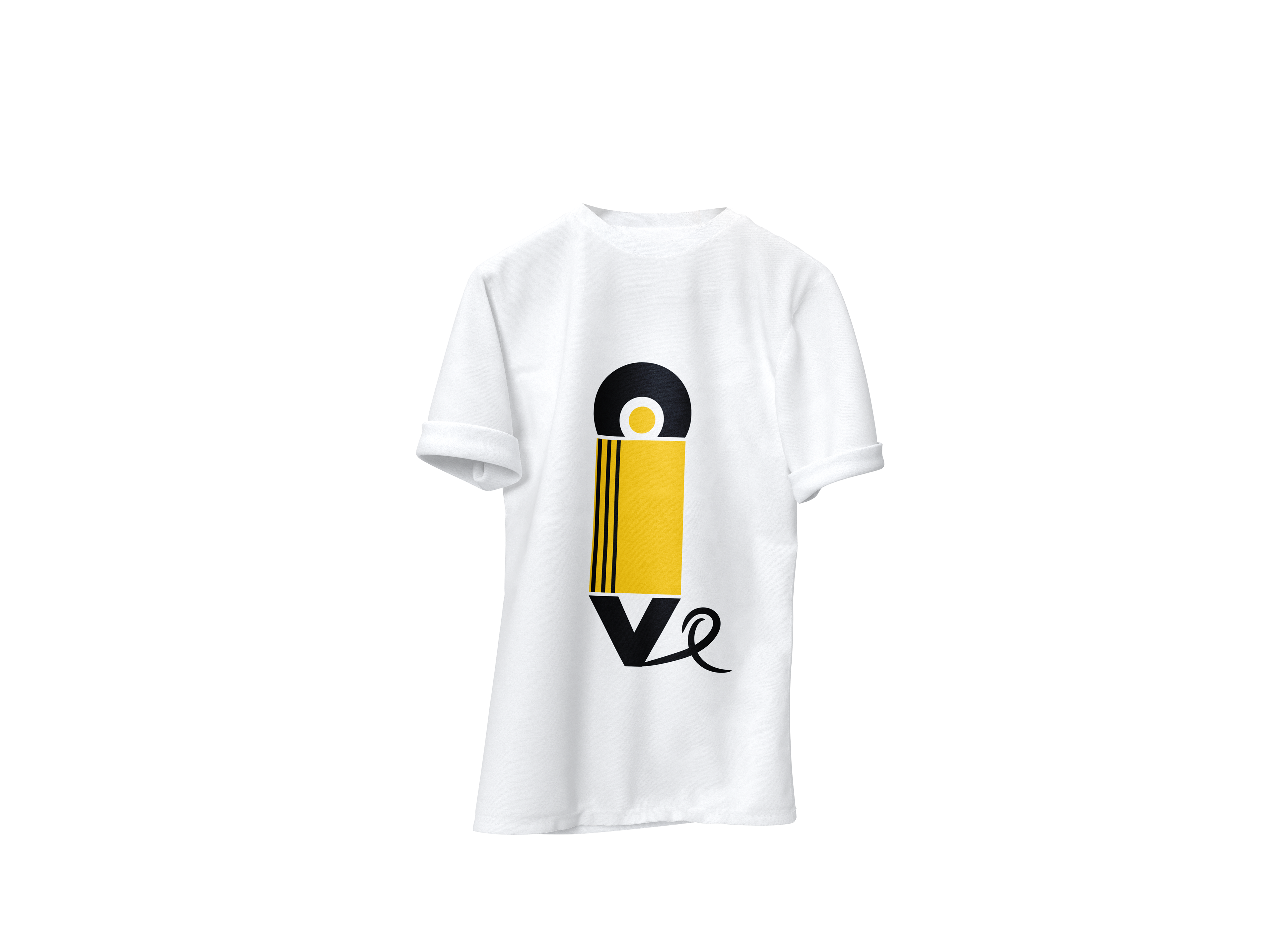
The logo is made up of my initials C V from the top and bottom of the object. The color palette prioritizes the yellow, reminiscent of the pencil used by all, the most economical, accessible and international.
The stroke is made up of the word VE, an acronym for my surname VELASCO and which at the same time in Spanish means the action verb Look. Thus the logo determinates and closes its meaning CAROL VE DESIGN. A double visual allusion where typography and image project the artistic and cultural trajectory that marks my professional path, and aims to invite the viewer, whoever they may be, to hold their creative ideas that are born free in the stroke of a pencil, to pursue them, share them, and keep creating new ones.
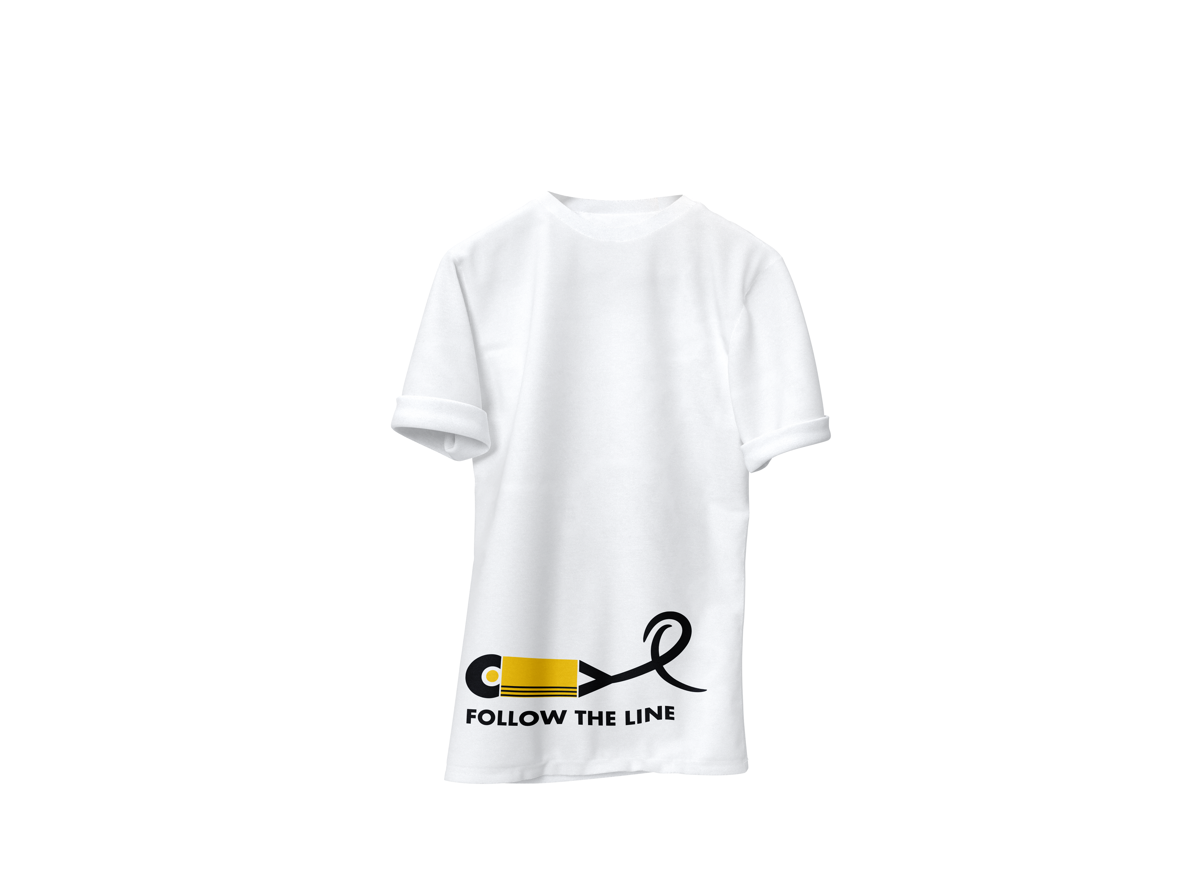
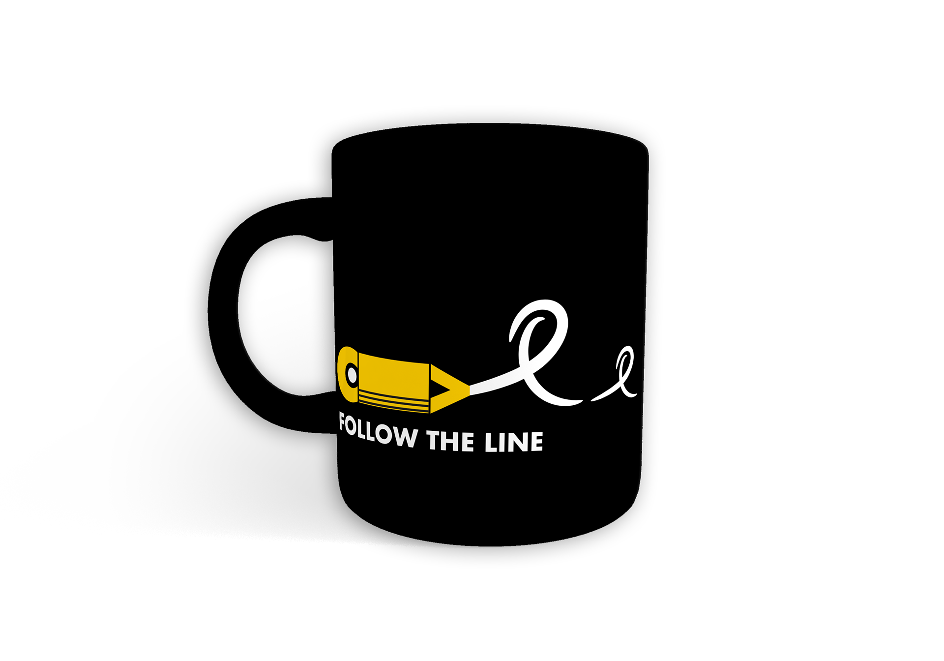
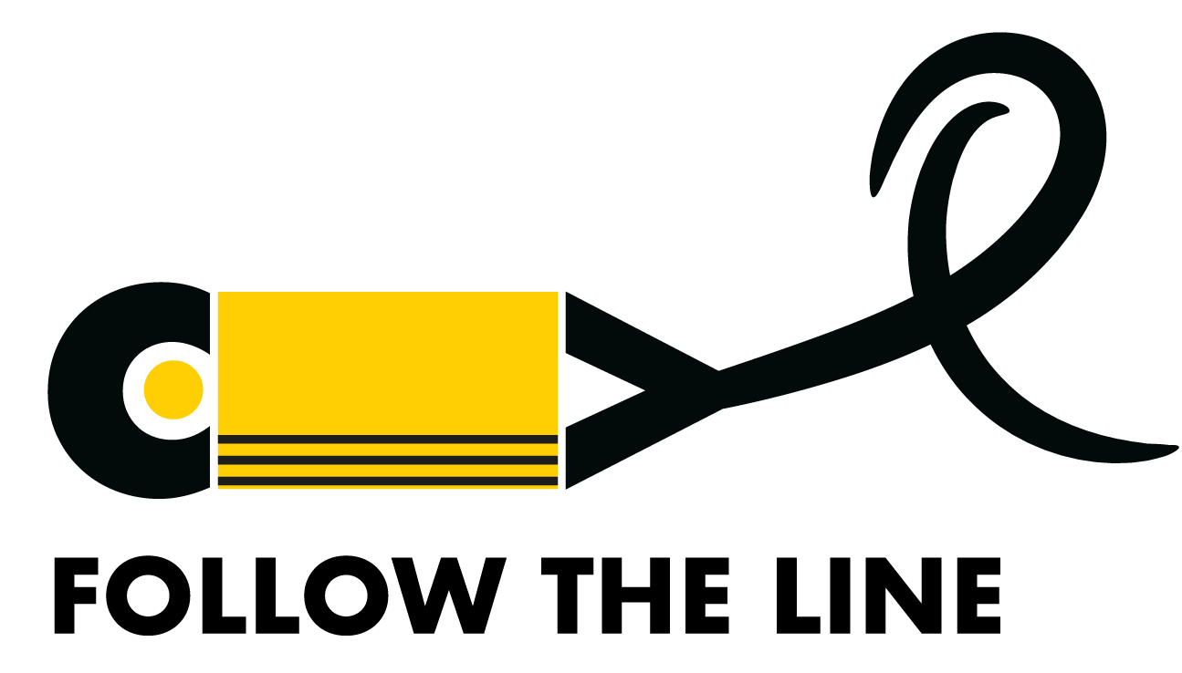
Please, Follow the line, the tagline of this brand, represents me personally but also invites YOU to open your eyes to creativity and make this world one without limits.
